

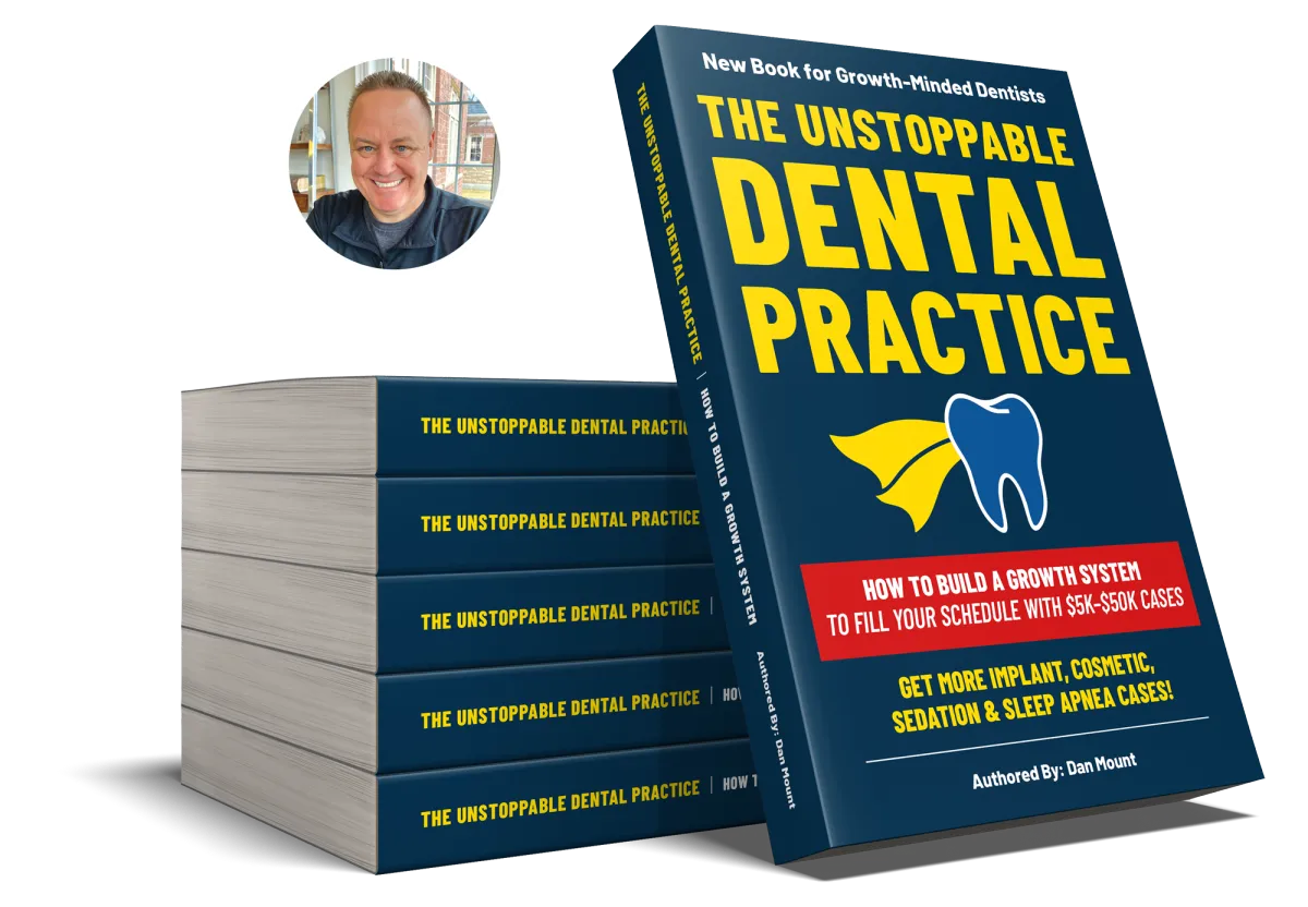
Get a Free Copy of Dan's Latest Book for Growth-Minded Dentists
The Unstoppable
Dental Practice
How to Build a Growth System to Fill Your Schedule With $5K-$50K Cases
Send Us Your Details…
We’ll send you a copy to your email!

Send Us Your Details…
We’ll send you a copy to your email!
You Are Here Because…
You Want More
Implant Patients
Boost your implant sales! Wake up referring patients! Transform your marketing! Explode your implant sales and production!
You Want to Build Authority & Trust by Becoming an Author
Becoming an author of a book about high-value dental services written for the patient will give you an “unfair advantage” over your competition.
You Want More Implant Patients
Boost your implant sales! Wake up referring patients! Transform your marketing! Explode your implant sales and production!
You Want to Build Authority & Trust by Becoming an Author
Becoming an author of a book about high-value dental services written for the patient will give you an “unfair advantage” over your competition.
You Want to Attract New Patient Families from Your Neighborhood
Find out why so many Dentists believe in the power of direct mail to grow their practice… and why you should too!
You Want to Dominate Your Competition Online
Learn how you can rank higher in the search engine results, convert more leads from your website and dominate your local market online.
Dear Doctor,
I want to welcome you to The Practice Marketers website.
Do you have a growth mindset for your practice and are willing to do whatever it takes to achieve your ultimate success?
For the past 25+ years we’ve been helping Dentists like you grow their practices by attracting more patients and retaining the ones they have.
While visiting this site, there’s a bunch of information that will help you understand exactly what it is we do.
After that, if any of this interests you, why not take a deeper dive and schedule a no-obligation discovery call with one of my team members.
Together we’ll take an extensive look at your practice and see if our practice growth systems for attracting and converting more patients are right for you.
We’re looking for the “best of the best Dentists” only, just click on the link to schedule your discovery call right now.
We look forward to speaking with you soon.


Dan Mount
Author, Entrepreneur and Founder of The Practice Marketers Inc.

More Implant Patients
Attract & Convert More High-Value Patients Like Clockwork!
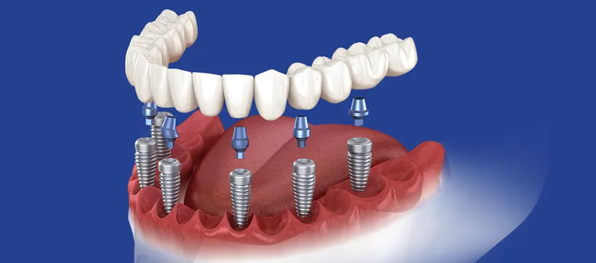
For many, the business side of dentistry is not getting any easier. Treating patients is rather straightforward but building a successful practice and actually having some time and energy left to enjoy it...that’s really becoming a challenge. The corporate dentistry machine is gunning for you. Reimbursements are dropping. And you have to see 4-6 times the number of patients to generate the same gross you did almost 20 years ago.
The possibility of working less, and making more, by reeling in more dental implant cases each month is within the reach of every dentist. Find out how to attract the maximum number of implant patients from your local area, month-after-month like clockwork!

Book Authorship Program
Author a Book about Dental Implants, Cosmetics or Sedation
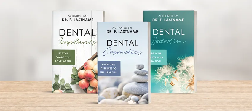
Do You Want…
More production and profits?
Restorative and cosmetic cases?
Higher big case conversion rates?
More consults and referrals?
Being the author of a book(s) puts you in a category-of-one and will give you instant authority and trust for the high-value procedures you love to do.
Attract More New Patients
From Your Neighborhood

Dominating your neighborhood has to be a multifaceted approach especially if you want to be attracting more new families from your local market. It’s important to use digital as well as traditional marketing strategies such as; SEO, PPC, Direct Mail and a Website designed to increase conversions.
If you need help with your online and/or offline presence just click the buttons below.
Promotional Products
Branded Giveaways for Your Dental Practice
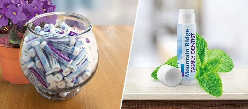
It may surprise you that one of the most effective forms of marketing can be done internally within your office at a low cost... The reciprocity principle is a basic law in social psychology that simply means that in many social situations people have a desire to pay back what we receive from others.
Your patients will be happy to receive one of our high-quality promotional products from your reception desk. Paying you back with continued appointments or even referring a friend when given the chance!
Check out our super popular all-natural mint flavored lip balm. These lip balm are sure to impress your patients, they can be customized with your practice information, or you can even get a completely custom label designed with your logo and inspired by your branding for free.
Visit our separate website for our promotional below.
Need help? Call our marketing team at 1-800-291-2291
Need help? Call our marketing team at
1-800-291-2291
At the Practice Marketers Inc. we are proud to provide our 1,500+ clients the tools and strategies they need to thrive, grow and become the top performing practice in their city.
Our proven practice growth and patient retention strategies have been tested and refined for the last 25+ years. Schedule Your Discovery Call to start growing your practice today!
© 2025 All rights reserved | Privacy, Terms & Conditions
© 2025 All rights reserved